_why’s gone: the death of a pseudonym

If ever you wanted proof that great artists are really appreciated only after they’re gone, have a look at the outpourings from various programming communities that seem to be in mourning at the moment for a man only known as _why, full name “why the lucky stiff”. He’s not even dead (we assume and hope). He just killed his online presence without any warning, announcement, or (at least so far) explanation. Pseudonyms and anonymous existence is something mostly removed from the open source world these days: we mostly know who the names behind the IRC handles are, we see the faces giving the presentations at the conferences. But if you don’t, when the persona goes, and the work goes, then it’s an effective death as far as our one-way relationship with the author goes. Maybe the unsettling aspect about _why’s disappearance is the reminder it is that life itself is abrupt. He punctured the appearance of permanence the online world can give, leaving his fans the final irony of discussing the motive of a man known as _why.

In response to his disappearance a repository of all his salvageable work is forming. His work was unique. His best-known piece, the Poignant Guide to Ruby is a remarkable combination of programming tutorial, comic, and whimsical automatic writing with everything from a cutout beard to the narrator (perhaps _why himself, some speculate) musing on his sister’s suicide attempt.

The biggest divide in the communities seems to be over whether _why was right to so completely and abruptly bring down all his works. He had the right to stop giving to the world; but did he have the right to take it back from the world?

It’s not as if this is an unprecedented struggle: witness the battle between Victor Nabokov and his closest supporters over the fate of his final unfinished book The Original of Laura. Nabokov wanted the manuscript burned upon his death, his supporters didn’t. _why pulled everything, his supporters and admirers wish he hadn’t. Thus the scramble to undo his last act by saving it all. We recognise that _why made some beautiful things; we don’t like the idea of them perishing.

The likes of Sourceforge and Github are littered with thousands and thousands of incomplete and abandoned works, ranging from the barely conceived, to the half-started, to the almost finished, to the finished but left behind and obsoleted by the flow of progress. Their creators are content, or at least apathetic enough, to leave these works to just remain as they are, to provide whatever value is left in them to those who would come later, perhaps in the hope that another programmer with the time and interest will resurrect it, to bolster line items on their resumes, or because it would be too much effort to remove them otherwise. When the effort to destroy your work is greater than that to sustain its existence, the act of removing everything you’re known for, in the process of crumpling up your entire persona, becomes the one of the most powerful statements you can make.

The natural question in response is to ask what exactly that statement is. John Resig praises what _why’s done, calling it Buddhist. Nothing lasts. Here today, gone tomorrow. Like a sand mandala. Zed Shaw rejects that and calls it nihilist. If everything is impermanent, nothing matters. Everything is allowable. Zed suggests karma as a fixer. Everything you do will come back to haunt you, so don’t be bad to others. Which I’m not sure I find reassuring.

If you can call this the death of _why as a persona, then it wasn’t any natural death. It was suicide. Everyone’s going to die some time, but suicides are socially taboo in most cultures, acts of tragically selfish hubris. They go against the ought we perceive in life. _why’s persona ought to have just faded into non-existence. His work ought to have been left out there to bit-rot. There’s a time to be born and a time to die; a time to plant and a time to uproot says Ecclesiastes. Everything fades, but eternity is in our hearts, so we’d rather rage against the dying of the light. The unease we feel at _why’s action is borne out of the mirror of life an online existence can be. He chose when to die, when to uproot his work, and it unsettles us.

The good news is of course that _why is only a persona. And the archivists have done a good job of preserving his major work. Which makes it all the more interesting that we’re arguing the morality of what he did.

The words that define you

Interesting site via RWW called Capitol Words, which uses congressional records to display the most frequently used words by different representatives. It’s neat in how it quickly gives an indication about where a representative may have spent most of their efforts in the past year, which is particularly interesting when looking at former candidates in the presidential race. Some word clouds from more famous representatives:

Ted Stevens, infamous on the web for his "Series of Tubes" speech, infamous elsewhere for his pork barrel projects and acceptance of paltry bribes

Ted Stevens, (R) Alaska, infamous on the web for his "Series of Tubes" speech, infamous elsewhere for his pork barrel projects and acceptance of paltry bribes

Ron Paul

Ron Paul, blimp pilot and strongly principled libertarian. Also detests fiat money.

Joe Biden, VP elect

Joe Biden, VP elect. I just realised I don't know much about him

Hillary Clinton

Hillary Clinton. Spent a lot of political energy this year and last on a universal health-care push.

John McCain

John McCain. Hard to call a dove, looking at this.

Barack Obama

Barack Obama's one is an interesting mix. Lots of Democrat keywords, particularly in the bit of internationalism and a domestic focus on social themes.

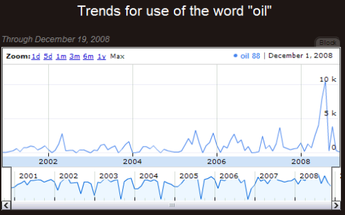
Additionally you can search by word. Think of it like Google Trends.

oil

I’d like to see someone (I really shouldn’t give myself the opportunity to procrastinate by doing this myself) do something similar with the NZ parliament’s Hansard. Actually I’d like to see someone generalise this so that it’s easy to plug in any sort of transcribed or written forum, from a Hansard to a blogroll to a Google Group to my email inbox to the SomethingAwful forums. Can someone go make that happen?

Weekend reading: Alexander Solzhenitsyn

The famous Russian dissident writer, championed and dismissed by both the left and right, is dead. His books (including One Day in the Life of Ivan Denisovich, Cancer Ward, and The Gulag Archipelago) brought to harsh light in the West the reality of live under the Soviet system, and helped destroyed the lingering appeal of Communism in liberal intellectual circles. Yet upon emigration he proved to be no fan of the West’s self-centric capitalism either, and so proved forever hard to understand to those who believed the world’s great struggle was over the dichotomy of socialism or the free market.

What follows is a quote-and-link-fest to peruse.

“Spiritual Death … has touched us all”– The Washington Post published this essay in 1974. It’s an appeal to his fellow Russians, an argument that the first step to take in breaking the climate of self-imposed oppression and an unjust zeitgeist is to stop echoing that which isn’t true.

When violence intrudes into peaceful life, its face glows with self-confidence, as if it were carrying a banner and shouting: “I am violence. Run away, make way for me — I will crush you.” But violence quickly grows old. And it has lost confidence in itself, and in order to maintain a respectable face it summons falsehood as its ally — since violence can conceal itself with nothing except lies, and the lies can be maintained only by violence. And violence lays its ponderous paw not every day and not on every shoulder. It demands from us only obedience to lies and daily participation in lies — all loyalty lies in that.

And the simplest and most accessible key to our self-neglected liberation lies right here: Personal non-participation in lies. Though lies conceal everything, though lies embrace everything, we will be obstinate in this smallest of matters: Let them embrace everything, but not with any help from me.

This opens a breach in the imaginary encirclement caused by our inaction. It is the easiest thing to do for us, but the most devastating for the lies. Because when people renounce lies it simply cuts short their existence. Like an infection, they can exist only in a living organism.

We do not exhort ourselves. We have not sufficiently matured to march into the squares and shout the truth out loud or to express aloud what we think. It’s not necessary.

It’s dangerous. But let us refuse to say that which we do not think.

The next is a full-length New York Times obituary. (For a shorter obituary, The Economist does well). The authors observe he expanded on this theme.

He wrote that while an ordinary man was obliged “not to participate in lies,” artists had greater responsibilities. “It is within the power of writers and artists to do much more: to defeat the lie!”

The first time I came across Solzhenitsyn was in a Reader’s Digest reprint of his famous Templeon Address on why Communism ultimately failed: and to the chagrain of some of his Western supporters, with “Men Have Forgotten God” he disregarded politics or economics as the primary root failure of Russia:

It was Dostoevsky, once again, who drew from the French Revolution and its seeming hatred of the Church the lesson that “revolution must necessarily begin with atheism.” That is absolutely true. But the world had never before known a godlessness as organized, militarized, and tenaciously malevolent as that practiced by Marxism. Within the philosophical system of Marx and Lenin, and at the heart of their psychology, hatred of God is the principal driving force, more fundamental than all their political and economic pretensions. Militant atheism is not merely incidental or marginal to Communist policy; it is not a side effect, but the central pivot.

In that same address he pulled no punches and went on to contrast the Soviets’ external attack on faith with the West’s inner attack:

The West has yet to experience a Communist invasion; religion here remains free. But the West’s own historical evolution has been such that today it too is experiencing a drying up of religious consciousness. It too has witnessed racking schisms, bloody religious wars, and rancor, to say nothing of the tide of secularism that, from the late Middle Ages onward, has progressively inundated the West. This gradual sapping of strength from within is a threat to faith that is perhaps even more dangerous than any attempt to assault religion violently from without.

Imperceptibly, through decades of gradual erosion, the meaning of life in the West has ceased to be seen as anything more lofty than the “pursuit of happiness, “a goal that has even been solemnly guaranteed by constitutions. The concepts of good and evil have been ridiculed for several centuries; banished from common use, they have been replaced by political or class considerations of short lived value. It has become embarrassing to state that evil makes its home in the individual human heart before it enters a political system. Yet it is not considered shameful to make dally concessions to an integral evil. Judging by the continuing landslide of concessions made before the eyes of our very own generation, the West is ineluctably slipping toward the abyss…

…When external rights are completely unrestricted, why should one make an inner effort to restrain oneself from ignoble acts?

Stratfor’s George Friedman tries to pin down what it was that both liberals and free-marketeers failed to understand about Solzhenitsyn’s politics and desires for Russia, and concludes that he may be getting his wish.

Liberals realized that Solzhenitsyn hated Soviet oppression, but that he also despised their obsession with individual rights, such as the right to unlimited free expression. Solzhenitsyn was nothing like anyone had thought, and he went from being the heroic intellectual to a tiresome crank in no time. Solzhenitsyn attacked the idea that the alternative to communism had to be secular, individualist humanism. He had a much different alternative in mind.

Solzhenitsyn saw the basic problem that humanity faced as being rooted in the French Enlightenment and modern science. Both identify the world with nature, and nature with matter. If humans are part of nature, they themselves are material. If humans are material, then what is the realm of God and of spirit? And if there is no room for God and spirituality, then what keeps humans from sinking into bestiality? For Solzhenitsyn, Stalin was impossible without Lenin’s praise of materialism, and Lenin was impossible without the Enlightenment.

From Solzhenitsyn’s point of view, Western capitalism and liberalism are in their own way as horrible as Stalinism. Adam Smith saw man as primarily pursuing economic ends. Economic man seeks to maximize his wealth. Solzhenitsyn tried to make the case that this is the most pointless life conceivable. He was not objecting to either property or wealth, but to the idea that the pursuit of wealth is the primary purpose of a human being, and that the purpose of society is to free humans to this end.

Solzhenitsyn’s famous 1978 Harvard commencement address “A world split apart” shows this viewpoint well, laying great fault at the feet of Enlightenment philosophy and its natural successors for the West’s spiritual decline:

I have spent all my life under a Communist regime and I will tell you that a society without any objective legal scale is a terrible one indeed. But a society based on the letter of the law and never reaching any higher fails to take full advantage of the full range of human possibilities. The letter of the law is too cold and formal to have a beneficial influence on society. Whenever the tissue of life is woven of legalistic relationships, this creates an atmosphere of spiritual mediocrity that paralyzes man’s noblest impulses…

…This tilt of freedom toward evil has come about gradually, but it evidently stems from a humanistic and benevolent concept according to which man — the master of the world — does not bear any evil within himself, and all the defects of life are caused by misguided social systems, which must therefore be corrected. Yet strangely enough, though the best social conditions have been achieved in the West, there still remains a great deal of crime; there even is considerably more of it than in the destitute and lawless Soviet society… The center of your democracy and of your culture is left without electric power for a few hours only, and all of a sudden crowds of American citizens start looting and creating havoc…

…How has this unfavorable relation of forces come about? How did the West decline from its triumphal march to its present debility? Have there been fatal turns and losses of direction in its development? It does not seem so. The West kept advancing steadily in accordance with its proclaimed social intentions, hand in hand with a dazzling progress in technology. And all of a sudden it found itself in its present state of weakness.

This means that the mistake must be at the root, at the very foundation of thought in modern times. I refer to the prevailing Western view of the world in modern times. I refer to the prevailing Western view of the world which was born in the Renaissance and has found political expression since the Age of Enlightenment. It became the basis for political and social doctrine and could be called rationalistic humanism or humanistic autonomy: the pro-claimed and practiced autonomy of man from any higher force above him. It could also be called anthropocentricity, with man seen as the center of all.

Finally, The Economist‘s retrospective asks the question of who is filling Solzhenitsyn’s role today in “speaking truth to power” both in Russia, in developing nations, and in the West.

What price a byline? (Or: what’s wrong with Knol)

A reader criticised my frequent referencing of Wikipedia in my last post, on the basis that everyone knows what WP is and that indeed some of us have Firefox extensions[1] to make quickly consulting it easy. I admitted he had a point, prompting another reader to protest that it doesn’t matter where the links go to, as long as they’re informative and well-written. The degree to which they were both right was strikingly indicative of how far WP has come. Given that it’s so often the first search result on Google for a huge number of queries, making explicit links to it can seem like adding links to dictionary.com for longer semantemes[2]. And the reason I reference it so often is that its collective writing style and usual accuracy is ideal for a quick introduction to what may be unfamiliar ground.

But its status as the #1 go-to place for so many Google queries didn’t go unnoticed in Mountain View. Yesterday Google finally released their long-in-development About.com-mimic Knol. A “Knol” is an unnecessary neologism coined by Google to mean a “unit of knowledge”, but seems the basic idea is to compete with Wikipedia on the authoritative content front, by meeting one of the oft-heard (albeit not so much anymore, if only due to exhaustion) criticism of WP: that you can’t trust it because you don’t know who wrote it. Knol’s point of differences with WP are then as follows:

  • You can have more than article on a topic.
  • Articles are signed by their authors
  • Advertising will be displayed, and it will be split with authors.
  • The level of collaborative editing allowed on each article is controlled by the author, as is the licensing.

I’ve been reading through a few of its articles, and what’s striking me is what they’ve lost by not having universal editing. So often WP was compared to the Encyclopedia Brittanica. Knol tries to compromise between the two, but in doing so completely erodes the role of the editor. The person who doesn’t actually write the content, but polishes it to a publishable standard, and makes it consistent with the rest of the corpus of work. Today’s featured Knol is on Migraines and Migraine Management. It’s written by a neurologist, so you know it’s authoritative, and it doesn’t allow public editing, so you know it hasn’t been tampered with.

But compare it with WP’s article on Migraines, and you’ll see just how needing of an editor it is. It’s written as if it’s intended for paper, with non-hyperlinked cross references “Migraine is defined as a headache that [TABLE 2]:”. “[TABLE 2]”, is a JPEG image at reduced size. There’s no reason for that and not an actual HTML table. (Additionally Google, there’s no reason for the images to be inline with the content like that. Consider a Tufte-like layout, where the tables and references and footnotes can go out to the side).

Throughout Knol you’ll find all sort of bad design practice. I swear I saw image hotlinking in one article before. But in particular, a lot the seed articles seem to be HTML dumps of articles already written by medical professionals, like this one. It’s closed collaboration, so unlike WP, you can’t just drop in and quickly format that into something presentable (at present there’s no change in style, the intra-page headings are just capitalised, there’s an odd amount of whitespace, and the page title itself isn’t capitalised).

There’s two big surprises here, given that this is a Google project, and how long it’s been in development there. And if they don’t fix this, I fear an epic failure.

The first is that they’ve provided such an unstructured writing environment. If you’re trying to create a body of high quality written material, there are ways you can structure your editing environment so that content conforms to certain styles and expectations. It’s particularly in Google’s interest to do so, since as they keep telling the SEO world, well-structured HTML and documents are easier for them to index and search. And yet Knol’s featured Migraines article has swathes of tabular content in the un-indexable, un-accessible JPEG format.

The second is much more subtle and can’t be fixed with as much of a technology patch as the first can. Google have failed to realise that often the most expert authors are going to be simultaneously the least equipped to properly format and polish their own documents (whether it be  due to lack of technical skills, or time), and also the least willing to submit their work to editorial changes from the unwashed anonymous masses. The fix for this I think will involve a recognition and separation of the two types of editing that happen on Wikipedia: authoring or fixing of content; and editing for quality control (fixing grammar, spelling, style, adding useful metadata to a document). Then build a system to acknowledge the good editors, not just the good authors. Then encourage authors to allow editorial changes from recognised quality editors. In fact, drop the “closed collaboration” option altogether.

This is even harder than getting good quality content in the first place. Writing is glamorous. Editing isn’t, but it’s so very important. Knol’s only got half the problem solved.

[1] Certainly one of my favourite extensions is the perenially useful Googlepedia, which remixes your Google search results to embed the first returned WP article on the right (It’s particularly nice on widescreen monitors).

[2] So it’s not a directly applicable synonym of ‘word’, but it was the best the thesaurus could give me

When bugs really do matter: 22 years after the Therac 25

At the moment my master’s work has me in the middle of what seems like an never-ending sea of runtime errors. It’s the largest Python project I’ve ever worked on, and I’ve been forced to re-learn a lot of practices that I really should have internalized a long time ago but never really did. I’ve also been able to play around with interesting meta-programming techniques (ie, modifying the language on the fly, so to speak, though not as much as a genuine macro system would allow) to stop certain types of bugs reoccurring.

As things progress, the new code settles down into something that actually runs more often than not, and becomes predictable. One thing I’ve relearned the value of has been the sanity check: throwing assert statements around like it’s going out of style, and I’ve found myself almost wishing Python had Eiffel’s native contracts[1]. Almost. I’m willing to pay the development time/code stability trade-off of this approach.

But it’s a whole other matter when you consider articles like this one from the Baltimore Sun (June 30). It’s about a forensic bug-hunter team at the FDA set up to address the growing dangers as software runs more and more medical systems. It talks up static code analysis as a possible solution, though after passing through the mainstream journalism medium it probably comes across as much more of a panacea than it really is. After all, there is no single magic pill for complex software like this.

One passage stood out though.

FDA officials declined to name the maker of the infusion pumps. (In 2006, Cardinal Health, of Dublin, Ohio, stopped production of its Alaris SE pumps because of a key-bounce error that reportedly killed two patients, including a 16-day-old baby that got 44.8 milliliters of intravenous nutrition, rather than 4.8 milliliters.)

During the investigation into the malfunctioning pumps, nurses complained about frequent keyboard errors, while the manufacturer blamed nurses for entering the wrong drug information and then failing to double-check, said Brian Fitzgerald, who heads the FDA’s software specialists.

A shade over 23 years ago an equally tragic disregard for a reported malfunction that appeared to have no effect gave radiation overdoses to 6 people. The Therac 25, a radiation therapy machine that had a subtle bug that led to massive overdoses, went down in software engineering history as being one of the most infamous cases of a race condition bug. There was a comprehensive (and quite readable) report that’s very much worth reading for all developers working on non-trivial software or electronics. And it makes for spine-chilling reading.

From the Boston Globe, June 20, 1986 (source):

MAN KILLED BY ACCIDENT WITH MEDICAL RADIATION

by Richard Saltos, Globe Staff

A series of accidental radiation overdoses from identical cancer therapy machines in Texas and Georgia has left one person dead and two others with deep burns and partial paralysis, according to federal investigators.

Evidently caused by a flaw in the computer program controlling the highly automated devices, the overdoses – unreported until now – are believed to be the worst medical radiation accidents to date.

The malfunctions occurred once last year and twice in March and April of this year in two of the Canadian-built linear accelerators, sold under the name Therac 25.

Two patients were injured, one who died three weeks later, at the East Texas Cancer Center in Tyler, Texas, and another at the Kennestone Regional Oncology Center in Marietta, Ga.

The defect in the machines was a “bug” so subtle, say those familiar with the cases, that although the accident occurred in June 1985, the problem remained a mystery until the third, most serious accident occurred on April 11 of this year.

Late that night, technicians at the Tyler facility discovered the cause of that accident and notified users of the device in other cities.

The US Food and Drug Administration, which regulates medical devices, has not yet completed its investigation. However, sources say that discipline or penalty for the manufacturer is unlikely.

Modern cancer radiation treatment is extremely safe, say cancer specialists. “This is the first time I’ve ever heard of a death” from a therapeutic rediation accident, said FDA official Edwin Miller. “There have been overtreatments to various degrees, but nothing quite as serious as this that I’m aware of.”

Physicians did not at first suspect a rediation overdose because the injuries appeared so soon after treatment and were far more serious than an overexposure would ordinarily have produced.

“It was certainly not like anything any of us have ever seen,” said Dr. Kenneth Haile, director of radiation oncology of the Kennestone radiation facility. “We had never seen an overtreatment of that magnitude.”

Estimates are that the patients received 17,000 to 25,000 rads to very small body areas. Doses of 1,000 rads can be fatal if delivered to the whole body.

The software fault has since been corrected by the manufacturer, according to FDA and Texas officials, and some of the machines have been retured to service.

… (description of the accidents)

The Therac 25 is designed so that the operator selects either X-ray or electron-beam treatment, as well as a series of other items, by typing on a keyboard and watching a video display screen for verification of the orders.

It was revealed that if an extremely fast-typing operater inadvertently selected the X-ray mode, then used an editing key to correct the command and select the electron mode instead, it was possible for the computer to lag behind the orders. The result was that the device appeared to have made the correct adjustment but in fact had an improper setting so it focussed electrons at full power to a tiny spot on the body.

David Parnas, a programming specialist at Queens University in Kingston, Ontario, said that from a description of the problem, it appeared there were two types of programming errors.

First, he said, the machine should have been programmed to discard “unreasonable” readings – as the injurious setting presumably would have been. Second, said Parnas, there should have been no way for the computer’s verifications on the video screen to become unsynchronized from the keyboard commands.

As the report makes devastatingly clear, there was far more wrong with the system than just those two issues in the last paragraph. The code-base as a whole was shoddy, there weren’t hardware failsafes to stop unreasonable behaviour, and there was insufficient or non-existent sanity-checking (i.e, checking an internal state of the program is sensible). From the report:

The operator can later edit the mode and energy separately. If the keyboard handler sets the Data Entry Complete flag before the operator changes the data in MEOS, Datent will not detect the changes because it has already exited and will not be reentered again. The upper collimator (turntable), on the other hand, is set to the position dictated by the low-order byte of MEOS by another concurrently running task (Hand) and can therefore be inconsistent with the parameters set in accordance with the information in the high-order byte. The software appears to contain no checks to detect such an incompatibility.

Take away point (and again, reading the report will give you several): Sanity checks are good. Make use of assertions. Code defensively.

But most staggering was the way the manufacturer AECL reacted to the news. The blame for why it took two years for the bug to be recognised can be laid at their feet for not responding adequately to reports of malfunctions. Their attitude can be summed up in this paragraph from the letter they sent to hospitals after the bug was found, describing how to keep the machine safely operational.

Effective immediately, and until further notice, the key used for moving the cursor back through the prescription sequence (i.e, cursor “UP” inscribed with an upward pointing arrow) must not be used for editing or any other purpose.
To avoid accidental use of this key, the key cap must be removed and the switch contacts fixed in the open position with electrical tape or other insulating material. For assistance with the latter you should contact your local AECL service representative.

Take away point: If problems occur because your software’s allowed to drift into a nonsensical state when the users use the keyboard too fast, it’s actually not really a fix to tell them to remove buttons so they can’t use the keyboard too fast. It seems comical in hindsight. But in 2006, the FDA noted in a press release how Alaris responded to their faulty infusion pumps:

In an August 15 recall letter, Alaris informed customers that it will provide a warning label for the pumps and a permanent correction for the key bounce problem once it is available.  In the letter, Alaris also provided recommendations to pump users on steps they can take to minimize key entry errors until the problem can be corrected. The steps are as follows:

Proper Stance
When programming pumps, stand squarely in front of the keypad (ideally with the pump at eye level for best visibility) to facilitate proper depth of depressing each key.

Listen
Focus on listening to the number of beeps while programming IV pumps; each beep will correspond to a single digit entry.  Unexpected double tone could indicate an unintended entry.

Verify Screen Display
When programming the pump or changing settings, always compare the patient’s prescribed therapy or the medication administration record, original order, or bar code device to the displayed pump settings for verification before starting or re-starting the infusion.

Independent Double Check
Request an independent double check of pump settings by another practitioner before starting or changing infusions with hospital-selected high alert drugs.

Look
Before leaving the patient’s room, observe the IV tubing drip chamber to see if the observed rate of infusion looks faster or slower than expected.  Adjust accordingly.

In a way, it’s worse than “take the key off the keyboard and tape it over”. At least that stopped the error as known from happening. So here’s a final take away point: Telling your users to be constantly checking the system hasn’t malfunctioned, saying you’ll send out a warning sticker and eventually a real fix, doesn’t really count as a fix. Relying on human vigilance isn’t a solution. Not when bugs really do matter.

[1] PEP316 actually proposed that contracts be added to Python. Current status: Deferred.

Food crisis coverup?

The commissar disapears

Here’s a case of state-sponsored photo manipulation that matches the boldness of Stalin’s celluloid liberties (like the disappearing commissar above).

Spot anything odd in this photo? It was attached to this news story.

Specifically that part. The part with the three layers of identical looking corn flakes.

The cereal’s been clone-stamped to make it look like a veritable cornucopia (Cornucopia. Heh). What’s the reality here? Is the media covering up a foodstuff shortage in NZ? Can we know that Hubbard is really smiling in the original? Maybe he’s casting his hands out in despair over the last cup of flakes left in the warehouse. Should I be hoarding Weet-bix and rolled oats?

Seriously, news photographers, clone-stamping does not improve the composition of your photos. It’s just ugly. It’s also like chartjunk in that it’s unnecessary, and though a very light shade of gray on the lie-spectrum, does say something about how you regard your audience. You’d think the bevy of stories about photographers being fired for taking similar compositional liberties would scare anyone in a newsroom a mile away from doing it.

The chart-junk of Steve Jobs

On June 9th Apple CEO Steve Jobs will take to the stage in San Francisco to give the keynote address at his company’s 2008 WWDC. Rumours are strong that he’ll be unveiling the second generation (or at least 3G capable) iPhone. He usually does about two big keynotes a year, and they’re almost always worth watching. Undeniably the best showman in the technology industry, he packs his own reality distortion field, a charismatic glow that can convince you of the urgent need to buy Apple’s latest product if you are to live a fulfilled iLife™. The older keynotes for significant product launches like the Macintosh launch, the unveiling of OS X, and the iPhone launch are particularly good examples[1]  worth watching to see how he brings the audience into the palm of his hand. He brings them up to speed with what the company’s been doing. He then starts naturally turning the topic into a story of a missing product in the market. He’ll talk about competitors’ products (if they have any) in that space, and talk about their short-comings, shaping the descriptions so that it becomes increasingly obvious what the perfect example of that product should look like. And then he unveils it, pulling it out of his pocket, pulling a sheet off it, or pulling it out of a manilla envelope. He’s spell-binding, and it’s only obvious what a talent he has when you see other CEOs try to emulate it and fail decidedly (warning: video autoplays).

One of the props he often relies on are graphical charts to show things like how marketshare of an product has been doing, or how a new one compares with competition for performance. Data presentation guru Edward Tufte has an expression for Job’s style: chart-junk. One of the themes Tufte keeps coming back to in his book Visual Explanations (which I’m reading and really quite enjoying at the moment) is that the magician is worth studying, as an example of a performer who acts out a lie. Learn from what he does, says Tufte, and then seek to do the opposite when presenting information. So it’s appropriate when you consider Job’s style how often he’s described as a magician. And the elements of a Stevenote are in some ways closer to a magic show than they are an honest data presentation. It’s sadly to be expected from what is in essence a marketing pitch. I’m always slightly annoyed when good marketing crosses the line into subtle dishonesty, and Jobs really shouldn’t have to engage in it. His products usually advertise on their own merits well enough.

On Tufte’s forum I saw a comment in a discussion on the sins of pie graphs pointing out this photo.

It’s actually horribly blatant. The Apple segment gets the closer perspective, and somehow 19.5% ends up with a bigger surface area than 21.2%.

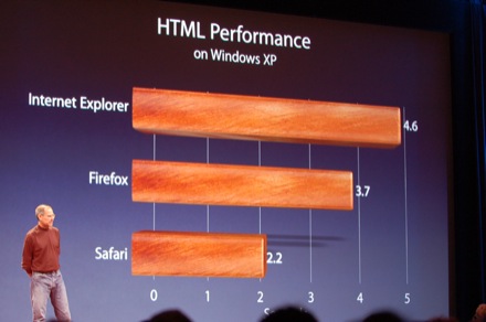
Wondering if he did this often, I delved off into the Engadget archives of their coverage of other Stevenotes. And found plenty of chart-junk. For each of these, spot the bias introduced by the 3D perspective, and how it always seems to fall in Apple’s favour when there’s a direct comparison to be made.

Above: It’s a performance comparison, so smaller numbers mean the faster software. Safari is Apple’s browser.

These two above aren’t so bad. But the parallax bias is there, and it is in Apple’s favour. Apple’s numbers fall the left of the vertical vanishing line, so get foreshortened.


He’s normally so good about have some numbers on a chart. In their absence, and the presence of a 3D perspective, it’s impossible to regard this chart as anything useful.

Tiger is the latest version of OS X in this case. Panther’s the previous one, and older is everything before that.

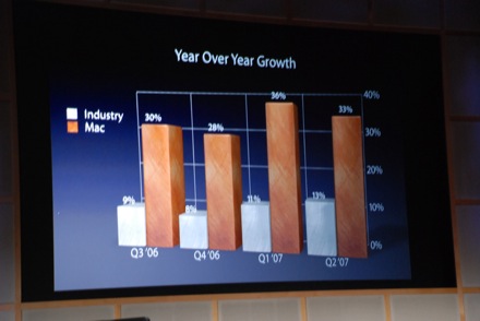
In a 2D graph you’ve got two opportunities to skew the data. Growth is good, so if you want to make the numbers at the right hand side of the graph look better, bring that end closer. But additionally in the vertical axis, we see the same parallax bias as the web browser performance comparison charts from above, so that the “Industry” figures get skewed to look even lower than the Mac’s.

This one’s angled and segmented slightly so that the Leopard (the latest version of OS X) area gets magnified, but there’s not much you can do about numbers that different.

This is the blurry successor to the first one. Apple’s the green segment. Again the upward perspective that the Apple segment benefits the most from.

Again, two perspective skews here for bias, and a style bias. The first is the obvious make-the-right-hand-side-closer angle to magnify the latest figures. Which is interesting, since the vertical bias (the vanishing point is in line with the top of the graph) is shrinking those numbers compared to the older ones. Which would appear to be counter-productive, until you read the title and realise that this is a cumulative sales graph. Which is an interesting choice in itself, since cumulative graphs are often hard to get meaningful data out of. They don’t go down after all. Which is why they chose this form for this slide. Growth is slowing. It’s inevitable with a product like the iPod, but there’s ways to soften the news. Combined with the choice of a cumulative graph, the vertical perspective now makes sense. The vertical perspective has the effect of playing down the early growth and maximising the latest, bringing the graph slightly closer to looking linear, than an S-shaped graph that’s beginning to hit the final plateau.

So come June 9 we’ll once again be invited to be spell-bound by Cupertino’s wizard, and expect more chart-junk. It’s fun to be sold a story like this, provided you’re aware that you are being sold one. It’s not a scientific presentation. Jobs is known for prizing aesthetic form, and in a way 3D charts look nicer than 2D. But I would question whether it’s honest to take this consistently a biased approach in presenting your data. And as Tufte asks in Visual Explanations, “Why lie?”

[1] Worth watching for the contrast to these celebrations of Appledom is the infamous Macworld 1997 keynote where he announced the company’s partnership with Microsoft to a congregration (any religious implications from that word are fully intended) that doesn’t buy into his forced enthusiasm. It’s rare to hear actual booing during a “Steve-note”, and the scene was recreated in the 1999 TV movie Pirates of Silicon Valley.

Using that second display: 4 news visualisations of questionable utility

For both yours and my ever decreasing attention spans, in the race to distinguish and spice up the daily news product, here’s more news, shallower, and faster.

MSNBC Spectra screenshot

Spectra from MSNBC is a pretty terrible romp into 3D. Pretty, but completely unusable and just rather useless. You select what channels of news you want, and as you do a selection of stories from each channel floats into the display as a rotating ring. It wouldn’t be so bad if you could actually click on the floating news items. But no, that does something completely unexpected, it ejects that entire ring of stores. To get to a story you want, you have to navigate via a ridiculous horizontal scrollbar. I thought we had learnt in the 90s that 3D interfaces like this just don’t work. From Information Aesthetics via Data Mining.

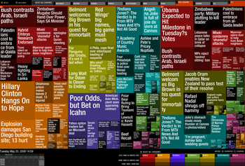
Newsmap

Moving from the realms of insanity to just the slightly overwhelming comes Newsmap, based off Google News.

Digg\'s \"Big Spy\" visualization

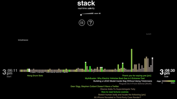
Digg\'s \"Stack\" visualization

From the very epitome of fickle and populist news rivers comes a selection of cool-looking, fast moving and not really that value-additive visualizations at their Labs section.

Mapped Up screenshot

Finally comes a low-key (and the most embeddable of the lot) Flash widget that just rotates geo-coded stories on a world map.

Will WinFS return? Will anyone care?

Guns N’ Roses started recording their ‘upcoming’ album Chinese Democracy in 1994. George Broussard started work on Duke Nukem Forever in 1997. Both titles have become standalone jokes in the music and game industries respectively, commonly regarded as having a release date in the vicinity of Armageddon. In some way, Microsoft has been working on WinFS (on and off, and not always under that name or scope. To be honest, I’m probably not being to fair them in this paragraph) since 1990, promised at some point to be released with multiple versions of Windows, and always pulled before release. When it appeared in the Longhorn betas (the OS that would become Vista), it was slow and incomplete, and the eventual news that it would be pulled from Vista too wasn’t terribly shocking. Vista itself was at risk of becoming a perpetual vapourware joke like Duke Nukem Forever, and after five years development MS was very painfully aware that they needed to get something out the door. So to much jeering at having once again over-promised and under-delivered, one of the three pillars of Vista was dropped.

Not that there wasn’t good reason for taking a long time about it. It was actually a really, really tricky problem they were biting off. Or an entire set of problems. WinFS was Microsoft’s latest iteration on their ongoing attempts to unify (or at least bridge) the concepts of a filesystem and a database. It’s the sort of proposal that automatically intrigue computer scientists, (as can be seen in the many other attempts at it). Why the hard separation between data stored as files, and data stored in a database? Surely the two could be unified, and imagine what it would bring! You could store your music and movies in a normal directory structure, and access them through the normal file access means, but browse them by artist, genre, or with queries such as “All movies directed by Steven Spielberg from the 1990s”.

Why it died

WinFS died as a monolithic entity that integrated into Windows for a number of reasons:

The Web – The concept of an Object Filesystem was something MS had been touting since 1990. It also made more sense back then. In 2006, with the web taking off and obviously becoming the new place for data to live, it didn’t so much. Why bother maintaining your contacts as entries in a local database so you could perform interesting queries on them when Facebook et al could do a better job for the most part, in a centralised location? And if this trend of apps moving to the web continues, then WinFS as a client-side application is weakened drastically as your data moves out of its purview.

Desktop search: good enough – The biggest use case scenario for why WinFS would be awesome inevitably worked out as being desktop search. But when Apple introduced Spotlight for OS X, which was just a simple (compared to what WinFS hoped to achieve) file indexing service it made a mockery of the need for such a complex solution to the problem. The release of Google Desktop for Windows put pressure on this wound. Eventually Microsoft released their own desktop search client for XP, an embarrassing and face-saving move given that file-indexing had already existed as a turned-off-by-default option in XP.

Embedded databases: good enough – The other client-side stories for why WinFS would be a good thing often involved media files. Everyone likes movies and music, and they’ve got lots of meta-data associated with them, like genre, year, length, artists, albums, etc. Lots of ways to order and query a collection. The problem for WinFS was it was never clear why this couldn’t be just as easily handled by an application-specific database. Like iTunes. And the tides were shifting on this front: cross-platform development has become important again. And SQLite is a lot more Mac and Linux-friendly than a new Windows-only API would be. It’s also a lot more existent. Developers like that.

But who can really say what “dead” means?

Jon Udell has an interesting interview [1](for certain definitions of “interesting”) with Quentin Clark, a manager at Microsoft who used to be the project manager on WinFS.

Take-away points:

– Microsoft proceeded to start rolling the WinFS development into its backend software efforts ADO.NET and SQL Server. This isn’t news. And it makes sense in its own way. If web-apps are going to be where we store our data in the future, then the databases backing them are going to become our filesystems in a sense. Although if you think about it that way, then we’re a good way already towards the WinFS vision, and WinFS as it was originally envisioned is once again undermined by good-enough approaches.

In the interview Clark talks about several features in SQL Server 2008 that keep alive the WinFS dream:

– They’ve added some filestream column-type, which reference files on the underlying NTFS partition rather than storing the data itself in the database, which makes for better performance for large binaries.

– They’ve added a hierarchical column-type. You know, hierarchical, like a directory structure.

– They’re going to add a Win32 namespacing function, which will expose the database to Windows as another file storage device you can then browse and do all the usual fun stuff. WinFS by complex stealth. There’s more than one project for Linux that does the same thing through FUSE.

So in short, SQL Server 2008 will/is able to store large files just as well as NTFS is able to. It will be able to describe hierarchial data structures. It will be accessible from the Win32 file-system APIs. It’s pretty much offering all WinFS did, except for the client-side specific schemas (such as contacts, music, etc).

It’s also still as useless for most users.

I think the interesting part about all this (certainly SQL databases are a subject I struggle to get excited about) is that once you examine the WinFS idea from the server end of things, stripped of the client-side schemas and vapourous UIs and dubious use-cases, it’s pretty mundane. That is, it’s everyday stuff. The critical step’s already tak[en/ing] place: we’re moving our own data off the filesystems and into the cloud, where they’re shaped behind the scenes into whatever schema is best for the application, with an interface on the front-end designed to fit that structure. Files can exist in multiple folders in Google Docs. Social networking sites deliver on much and more of the contacts functionality originally promised by WinFS. iTunes structures your music collection as a simple database and collection of playlists built from queries into it (dynamically if you wish). The battle WinFS was going to fight has already been won. The next one is one Microsoft was never going to fight anyway, one for the structure and open exchange of this data.

[1] Via OS News

I’ve got brick and ore for wheat

In the world-popular board game Settlers of Catan, there’s six types of land tiles that you can occupy in order to obtain resources to fuel your growing empire. Quarries for brick, mountains for ore, forests for wood, plains for wheat, and grasslands for sheep. In your bog standard Settlers game, the most important two to secure are invariably brick and wood: you need them to build settlements and roads, and the game will often go to who can expand the fastest. But in the expansion set Knights and Cities, the games take longer, and the dynamic shifts. Invariably I find the most important land tile to secure in the long-distance run are plains. In the longer game you run up against limits of land. You reach the point where you can’t gain points from expansion anymore, and so you must develop what you have. Your settlements have to turn to cities, and that takes wheat (and ore). Then you need to raise and maintain knights to defend them, and that takes wheat too. The thing about the game is that if you only realise this need once you’re starting to turn your settlements into cities, you’re going to be starved by the players who occupied all the prime spots from the start. The game’s often made or lost by what tiles you initially claim.

Food supplies are one of those things you have to think long term about if you want to win. And two of the latest Stratfor podcasts[1] give an insight into how one of the governments more known for its long term thinking is viewing this particular phase of play, given the current food and fuel crisis.

The first discusses a proposal by China’s agricultural ministry to provide incentives (think tax breaks, subsidies for farm buildings and projects, etc) for companies to purchase or lease farmable land in foreign countries, and particularly Australia. This indicates the long term aspect of their planning: currently four out of ten Chinese are farmers (albeit in a peasant economy), and it’s still a net food exporter. But the podcast cites a McKinsey report saying that China’s urban population will reach 1 billion by 2030. By 2025 there’ll be 219 cities in the country with individual populations >1M.  And for a country with currently 19.6% of the world’s population, it’s only got 9% of the world’s arable land. Additionally, the east asia analyst that starts talking partway through points out that food imports are historically important to China as a result of their Great Famine (although looking back over the list, they’ve had a few).

So they’ve been acquiring foreign land for this purpose since the mid 90s in places like Cuba and the Philippines. This is not new. That they will be looking to Australia is. To continue the Settlers allusion, Australia can be thought of as two of the world’s largest quarry and plains tiles.

As the second podcast goes into detail to explain, although Australia is commonly regarded as drought stricken (which it still is in the wheat and rice-producing parts, but it’s hopefully emerging from this), its northern states particularly have great potential for agriculture (ie, it rains there in tropical amounts). And it’s very underdeveloped in this aspect. It’s more that the rice and wheat growers are partially where they are (ie, under drought) for historical reasons as much as anything else, and prefer the southern climate. Australia stands to gain from it in a small way (93% of all foreign owned land in Australia is Crown lease-hold, rather than freehold, and at least Victoria imposes a 20% additional land tax on foreign owners [2]), but it’s probably not how the government would like to see things going down. It’s far better for them to actually export it to China, and make use of the Free Trade Agreement they’re currently negotiating. I wouldn’t be surprised if the Australians do pass some more protectionist laws in this regard. Its use-of-local-labour and property ownership laws and are strong when it comes to foreign entities. Additionally in the north most land isn’t freehold but leasehold [3]. That makes things easier for the government, but they are still very much constrained by the free market. A lot of farmers there are hurting from the drought, and China’s willing to spend large on long term assets.

Other countries China’s interested in (and there are a few, in the interests of risk management by diversification) include that other big grain bowl of the world, Russia. But it’s one thing for them to talk about buying land in Australia, and another in their large, border-sharing neighbour. The Russians are even more sensitive about foreign ownership of land, and if the new president Dmitry Medvedev is anything like his patron Putin (who was rather strident in nationalizing gas and oil supplies), then he probably isn’t going to be a strong advocate for free market liberalization and foreign investment. The Stratfor podcast concludes that if similar farm purchases happen in Russia, we won’t be hearing much about them due to this sensitivity. I expect that if it does start happening in Australia, particularly near an election cycle, we’ll be hearing plenty about it. The Australian reaction will be worth watching.

This can be regarded as an over-cautious strategy in some ways. China’s economy will soon be the world’s largest again. It’ll have money to buy its food for a long time. So this is interesting (even if it doesn’t happen) in how it shows how sensitive the Chinese government is to food pricing. To keep a population that large happy, you need a lot of bread, and a lot of ciruses.

[1] If anyone’s feeling particularly generous and for some reason wants to spend several hundred dollars on a birthday present for me next month, I’d appreciate a StratFor subscription. Failing that, I’ll just keep on going with their free content features. Their daily podcasts I can particularly recommend as being a neat way to go beyond the typical media depths (shallows) of analysis.

[2]  Doug Cocks – Use with Care: Managing Australia’s Natural Resources in the Twenty-First

[3]  http://www.bmr.gov.au/education/facts/tenure.htm